Elements
An element is a rectangle in a user interface. Every image, piece of text and group in an interface is an entity with an element component, and it is laid out relative to its parent element, or to the screen if it sits directly below one. This page covers the layout that all elements share. What an element draws is covered on the Image Elements and Text Elements pages.
Element Types
The type of an element decides what it draws:
| Type | Draws | Used for |
|---|---|---|
Group (pc.ELEMENTTYPE_GROUP) | Nothing | Containers, layout groups and invisible input areas. See Group Elements |
Image (pc.ELEMENTTYPE_IMAGE) | A solid color, a texture or a sprite | Panels, icons, buttons and masks. See Image Elements |
Text (pc.ELEMENTTYPE_TEXT) | A string, in a font asset | Labels and any other text. See Text Elements |
Anchor
The anchor says where on its parent an element is attached. It is given as fractions of the parent's width and height, from 0, 0 at the bottom-left corner to 1, 1 at the top-right, and it has four numbers: the left, bottom, right and top edges of the anchor. When the left edge equals the right and the bottom equals the top, the anchor is a single point. The element then keeps its own width and height, and its position is an offset from that point. Anchoring to a corner keeps an element in that corner, however the size of the parent changes.
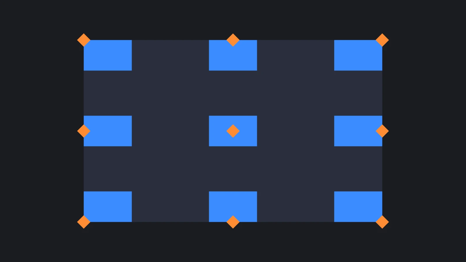
The Editor's Preset field sets the common combinations for you. Each preset except Stretch comes in two versions: Anchor sets the anchor only, and Anchor & Pivot also moves the pivot to the same point, so that the element sits inside the corner or edge rather than centered on it:
| Preset | Anchor | Pivot |
|---|---|---|
| Top Left Anchor & Pivot | 0, 1, 0, 1 | 0, 1 |
| Top Anchor & Pivot | 0.5, 1, 0.5, 1 | 0.5, 1 |
| Top Right Anchor & Pivot | 1, 1, 1, 1 | 1, 1 |
| Left Anchor & Pivot | 0, 0.5, 0, 0.5 | 0, 0.5 |
| Center Anchor & Pivot | 0.5, 0.5, 0.5, 0.5 | 0.5, 0.5 |
| Right Anchor & Pivot | 1, 0.5, 1, 0.5 | 1, 0.5 |
| Bottom Left Anchor & Pivot | 0, 0, 0, 0 | 0, 0 |
| Bottom Anchor & Pivot | 0.5, 0, 0.5, 0 | 0.5, 0 |
| Bottom Right Anchor & Pivot | 1, 0, 1, 0 | 1, 0 |
| Stretch | 0, 0, 1, 1 | Unchanged. Also sets the margins to 0 |
For example, this score sits in the top-right corner of the screen, 20 units in from each edge:
- Engine
- Editor
- React
- Web Components
const score = new pc.Entity('score');
score.addComponent('element', {
    type: pc.ELEMENTTYPE_TEXT,
    fontAsset: font.id,
    text: '1250',
    anchor: [1, 1, 1, 1],
    pivot: [1, 1]
});
score.setLocalPosition(-20, -20, 0);
screen.addChild(score);
Set Preset to Top Right Anchor & Pivot and the entity's position to (-20, -20, 0). The Anchor field shows the four numbers in the order left, bottom, right, top.
<Entity name="score" position={[-20, -20, 0]}>
  <Element type="text" fontAsset={font} text="1250" anchor={[1, 1, 1, 1]} pivot={[1, 1]} />
</Entity>
<pc-entity name="score" position="-20 -20 0">
    <pc-element type="text" font-asset="arial" text="1250" anchor="1 1 1 1" pivot="1 1"></pc-element>
</pc-entity>
An element created without an anchor and a pivot, whether from code, in React or in Web Components, is anchored at 0, 0, 0, 0 with its pivot at 0, 0: the bottom-left corner of its parent. Set both whenever you create one.
Pivot
The pivot is the point of the element that is placed at its position, given as fractions of the element's own width and height: 0, 0 is its bottom-left corner, 0.5, 0.5 its center and 1, 1 its top-right corner. An element with a centered anchor and a centered pivot sits in the middle of its parent, while one with a centered anchor and a 0, 0 pivot has its bottom-left corner in the middle.
The pivot is also the point an element rotates and scales around:
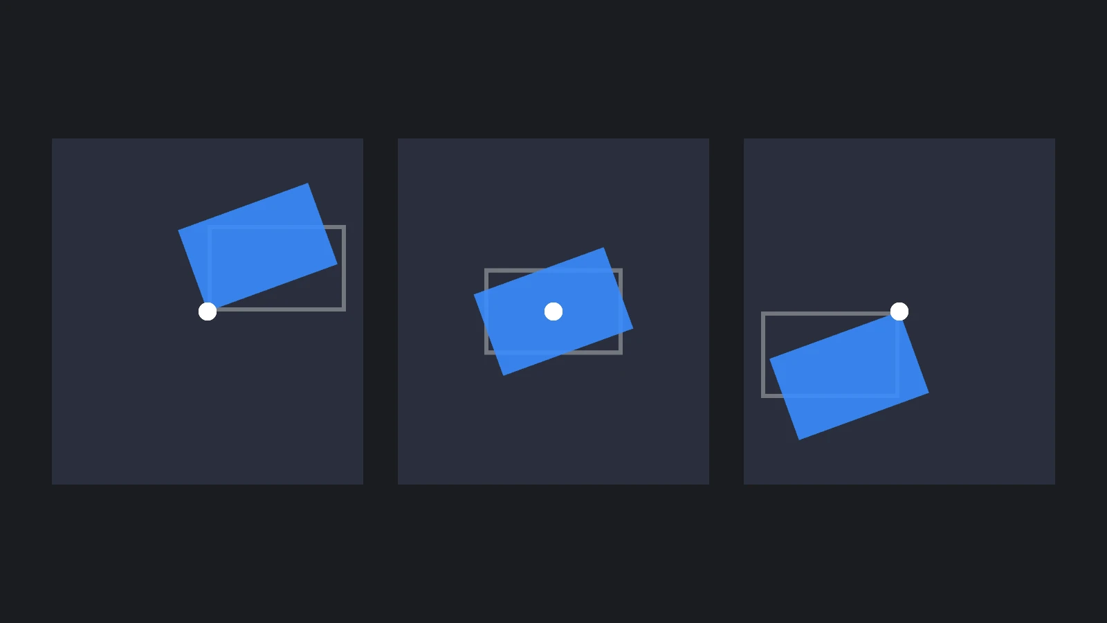
// Spin an icon about its center
icon.element.pivot = new pc.Vec2(0.5, 0.5);
icon.setLocalEulerAngles(0, 0, 20);
Split Anchors
When the two edges of the anchor differ on an axis, the anchor is split on that axis: the element's edges are attached to two different points of the parent, and it stretches with the parent on that axis. Its width or height on that axis then comes from the anchor and the margins, and the value of width or height is ignored.
A bar across the top of the screen, for example, is split horizontally and keeps a fixed height:
// Attach the bar's left and right edges to the left and right of its parent, at the top
bar.element.anchor = new pc.Vec4(0, 1, 1, 1);
bar.element.pivot = new pc.Vec2(0.5, 1);
bar.element.left = 0;
bar.element.right = 0;
bar.element.height = 80;
Changing an anchor keeps the element's current margins, so set the margins of a newly split axis as well, as left and right do here. The same applies when you create an element with a split anchor: without a margin, it starts with the default margins of 0, 0, -32, -32, the edges of the default 32 × 32 size, and overhangs its right and top anchors by 32 units.

Margins
The margin is the distance of each edge of the element from its anchor, on the axes where the anchor is split. It has four numbers, in the order left, bottom, right, top, and positive values move each edge inwards. A panel that fills its parent apart from a 20 unit border has the Stretch anchor, 0, 0, 1, 1, and a margin of 20 on every side:
- Engine
- Editor
- React
- Web Components
const background = new pc.Entity('background');
background.addComponent('element', {
    type: pc.ELEMENTTYPE_IMAGE,
    anchor: [0, 0, 1, 1],
    margin: [20, 20, 20, 20],
    color: new pc.Color(0.16, 0.18, 0.23)
});
panel.addChild(background);
Set Preset to Stretch and each Margin value to 20. The inspector only enables the left and right margins when the anchor is split horizontally, and the bottom and top margins when it is split vertically.
<Entity name="background">
  <Element type="image" anchor={[0, 0, 1, 1]} margin={[20, 20, 20, 20]} color="#292e3b" />
</Entity>
<pc-entity name="background">
    <pc-element type="image" anchor="0 0 1 1" margin="20 20 20 20" color="#292e3b"></pc-element>
</pc-entity>
The left, bottom, right and top properties read and write the four margins one at a time. To set all four at once from code, assign a new pc.Vec4, as the margin setter copies from one:
background.element.left = 40;
background.element.margin = new pc.Vec4(10, 10, 10, 10);
Width and Height
An element has two sizes:
widthandheightare the size as set, in screen units. They apply on the axes where the anchor is a point.calculatedWidthandcalculatedHeightare the size the element actually has. They differ fromwidthandheighton an axis where the anchor is split, and when a layout group sizes the element.
A text element can also set its own size to fit its text. Read the calculated size whenever you need the size an element is shown at, for example to fit a background to a label:
background.element.width = label.element.calculatedWidth + 40;
Resizing in the Editor
In the Editor, select an element and choose Resize Element Component in the toolbar, or press 4, then drag a corner handle in the viewport to change the element's width and height. The opposite corner stays where it is. Whenever an element on a screen is selected, the viewport also shows grey handles at the corners of its anchor, and dragging them changes the anchor.
The viewport draws a 2D screen as a flat rectangle in the 3D scene. Switch the viewport camera to Front to look at it straight on.
Group Elements
A group element draws nothing, but it has a position and a size like any other element, so it is the tool for organizing an interface:
- Containers. Put the parts of a panel, a menu or a HUD below a group, and move, resize, show or hide them all together. Disabling the group's entity hides everything below it.
- Layout. A layout group is usually a group element that arranges its children.
- Invisible input areas. A group with input enabled receives input across its whole rectangle, which is how the content of a scroll view can be dragged by its empty space.
The color and opacity of an element apply to that element only. They do not cascade to its children, so fading a panel means fading every image and text element below it. See Common Widgets.
Rotation, Scale and Depth
Elements rotate and scale about their pivot through the entity's transform, with setLocalEulerAngles and setLocalScale, as in the pivot example above. Rotate about the z axis to keep an element in the plane of its screen.
The z position has no effect on a screen-space screen, where the hierarchy decides what is drawn on top (see Draw Order and Performance). On a world-space screen, it moves an element off the plane of the screen.
Reading an Element's Bounds
Three properties give the four corners of an element, in the order bottom-left, bottom-right, top-right, top-left:
| Property | Space | Use it to |
|---|---|---|
screenCorners | Pixels of the canvas's drawing buffer, from its bottom-left corner. For elements on screen-space screens | Compare elements with each other and with other drawing-buffer coordinates |
canvasCorners | CSS pixels, from the top-left corner of the canvas. For elements on screen-space screens | Place HTML over an element, or compare it with mouse positions |
worldCorners | World space. For elements on world-space screens and elements without a screen | Place 3D objects at an element, or cast rays at it |
Elements Without a Screen
An element does not need a screen. One with no screen ancestor is placed like any other entity, by its transform, and its width and height are in world units, so a 32 × 32 element is 32 meters across. Its anchors don't move it, but split anchors still size it against a parent element: anchored 0, 0, 1, 1 inside a 100 × 100 element, it is 100 × 100, and anchored 0, 0, 0.5, 0.5, it is 50 × 50. A lone element suits a single label or image in the world. For anything more, such as a panel with a layout or a menu, use a world-space screen.
See Also
- Image Elements - Colors, textures, sprites and 9-slicing
- Text Elements - Text layout, wrapping and effects
- Layout Groups - Arranging children in rows, columns and grids
- Element Component,
<pc-element>and ElementComponent - Reference for every element property